
Now that we’ve covered graphic design and UX tips for your analytics dashboards, let’s now dive into the heart of your data with the last post in our “spotlight on dataviz” series. We’ll go over the different types of diagrams and charts best adapted to your analyses and interpretations. With your graphs, leave nothing to chance – each visual should have a very specific purpose![]()
![]() , from overall performance tracking to comparing values, monitoring evolution, identifying correlations, and much more.
, from overall performance tracking to comparing values, monitoring evolution, identifying correlations, and much more.
KPI charts: high-level tracking
Use a KPI-type chart to get specific, immediate figures for your analysis period.
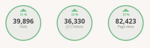
Practical tip: Make these key figures easy to see on your dashboard – at the top of the screen, for example – so that they can be consulted at a glance. To learn more, read our tips on dashboard layouts.
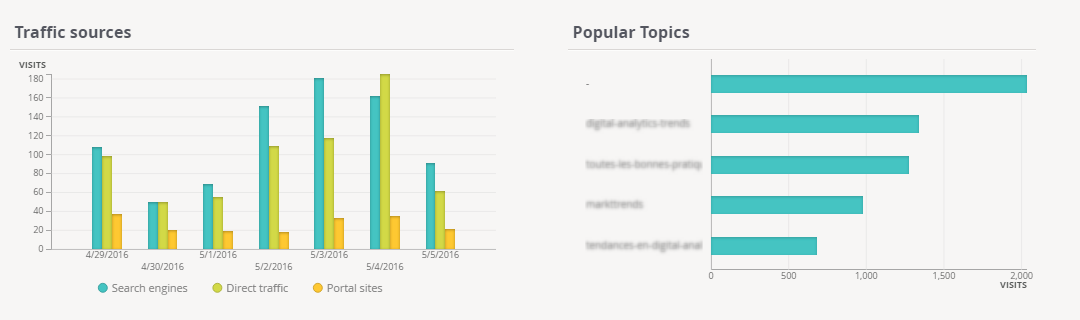
Bar charts: compare values
Bar charts give a precise overview and enable you to quickly compare values between each bar.
Practical tips:
- Whether vertical or horizontal, bar charts lend themselves best to comparing categories (like different traffic sources, different products sold, etc.).
- Need a deeper analysis, and need to compare several elements at once? Opt for a stacked column or bar chart.
Line graphs: track an evolution
Line graphs highlight major trends with respect to a time factor.

Practical tips:
- By adjusting granularity (displaying by day, week, month, or year), you can either refine your analysis, or on the contrary, take a step back for a higher-level view
- If you have several line graphs, a “stacked area”-type chart will help showcase datasets related to each element being analysed.
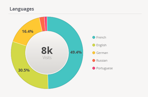
Pie charts: show proportions
Pie charts (as well as variations like donut charts or semi-circle donut charts) are naturally a good choice for highlighting the major components of a whole whose sum equals 100%.
Practical tips:
- Beware of displaying more than 6 elements in a pie chart, as the smallest segments will become increasingly harder to distinguish.
- Comparing several different pie charts among each other can be tricky, as it’s difficult to evaluate and compare the value represented by each segment.
- In terms of page layout, remember that pie charts and donut charts take up more space than other types of graphs and charts, because they must be accompanied by a legend.
Bubble charts: determine correlations
Bubble charts are especially useful for identifying correlations between several metrics. Each point corresponds to a category, whose weight is indicated by the bubble’s size and placement on the axes.

Practical tips:
- Using different colours will help you distinguish between each category, and using transparent bubbles will allow you to highlight the relationship between bubbles.
- As with pie charts, to ensure readability, beware of including too many different elements.
Tables: track content performance
Data tables lend themselves well to tracking the performance of editorial content, as they’re perfectly adapted to displaying title that are, at times, quite long.

Practical tips:
- Include sparklines next to each article title for a quick view of how traffic has evolved.
- A tag cloud is a great complement to your table – it will highlight the most popular topics, providing you with additional interesting content-related insights.
Heatmaps: identify intersections
Using heatmaps, you can compare data from different dimensions and observe overlaps and interconnections, thanks to a range of warm and cool colours.

Practical tips:
- Using strong colours will enable you to better demine the concentration of several different intersecting factors.
- Here, for example, in just one glance, you can identify the impact of a given traffic source during a specific day.
- The elements on your X- and Y-axis can be of different natures (period, metrics, dimensions).
Retention graph: measure recurring app engagement
The retention graph, or matrix, is used to measure the success of a mobile application. By studying the retention rate over a relatively long period (several days or weeks), you can analyse recurring usage of your application.

Practical tips:
- On a retention graph, the period being analysed is represented horizontally as well as vertically.
- To learn more about retention matrices, check out this article on how to read a retention graph.
Of course, there exist many other types of graphic representations and combinations of graphs which make it possible to easily interpret your data. With AT Internet’s tools, you can add all types of graphs to your performance management dashboards.
To wind up our “spotlight on dataviz” series, here are two last pieces of advice:
- Annotate the results: Be sure to provide comments and explanations for your dashboard users, based on their role and level of experience with digital analytics. Some ideas: provide definitions of metrics used, highlight trends that are forming, point out important distinctions or subtleties to consider.
- Add your personal touch: Don’t forget to make your analytics dashboards your own! Try integrating your company’s logo, as well as any other type of useful external data: images, tweets, Facebook comments, weather data…
Happy analysing!


Comments are closed.